I recently received a request to make a couple of new signs
for the store where I have my booth.
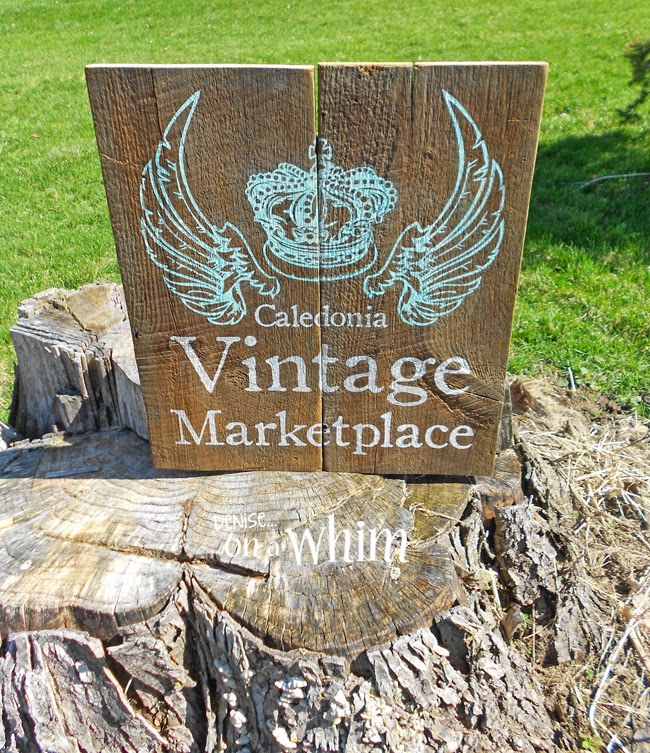
When the store owner emailed me this crown and wings graphic,
I wasn't too sure about the outcome.
But it turned out pretty cool!
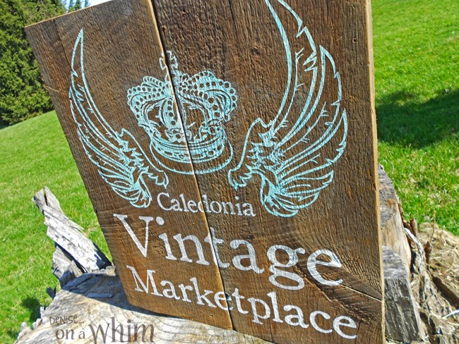
Here's a close up of the crown and wings.
It's pretty detailed and that's why I was worried.
You probably know by now that I use vinyl stencils
when painting all of my signs.
I was concerned that the size and detail of this graphic
would be a little much for that.
But, with a little extra care, it worked out well!
I used the same font for the lettering as I had used on a previous sign for the store.I used a minty turquoise for the wings and crown
and white for the lettering.
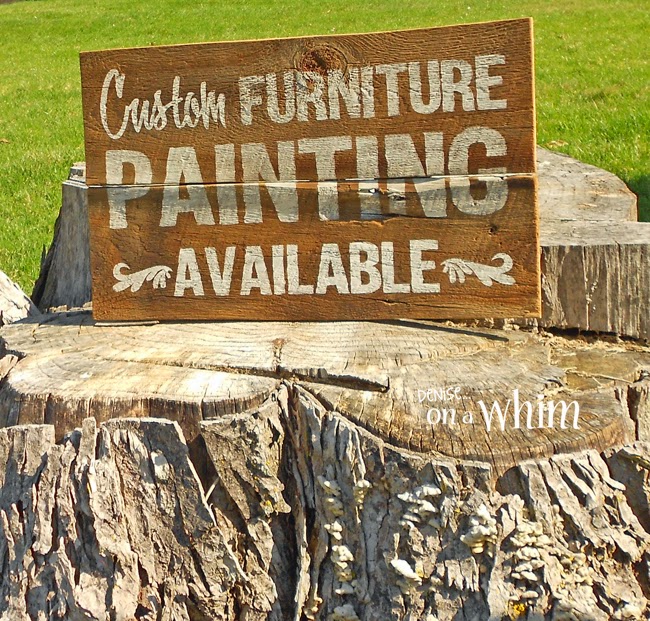
I made this sign, as well.
I used an embellishment I pulled off that previous sign design, too.
The store owner was very pleased.
I was really happy with them, too!
Let's keep in touch...
Your comments make me smile :) 'Til next time!


No comments:
Post a Comment
I love hearing from you and read all of your comments. They make my day! I'm sorry I can't reply to every one of them, but I sure do love reading them and appreciate every one!